The control can assume the appearance of a Office 2003 style button by setting its Surface property to SURFACE_OFFICE_2003.
The Office 2003 style carries new dedicated colors which replace the default colors set through the BackColor and ColorSurfaceNormal properties (with the exception of the outer border drawn when the SpecialEffect property is set to a value different from SpecialEffects.None).
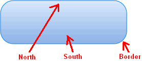
Office 2003 buttons are rendered through the use of a vertical linear gradient made up of 2 colors, one set to the North of the button and one set to the South of the button. If needed, an optional color can be applied to the border.

Depending upon the button state, all predefined colors may be changed; below a summary of colors applied (with involved properties) in various button states:
Normal
Office2003ColorNorth
Office2003ColorSouth
Office2003ColorBorder (if left undefined, the border will not be rendered)
Pressed
Office2003ColorNorthPressed
Office2003ColorSouthPressed
Office2003ColorBorderPressed (if left undefined, the border will not be rendered)
Mouse over
Office2003ColorNorthMouseOver
Office2003ColorSouthMouseOver
Office2003ColorBorderMouseOver (if left undefined, the border will not be rendered)
The border's width, expressed in pixels, can be modified through the Office2003BorderWidth property.
The simplest way to change colors and options applied to the Office 2003 style is to use, inside 3D Button Visual Editor, the Office 2003 style tab. At run-time each of these properties can be referenced by name.
Note: The images below have hot links to take you to explanations of the various button settings.

|
Item name
|
Description
|
Corresponding property
|
|
North color normal
|
The gradient color used for the Northern side of the vertical linear gradient in normal state
|
Office2003ColorNorth
|
|
South color normal
|
The gradient color used for the Southern side of the vertical linear gradient in normal state
|
Office2003ColorSouth
|
|
Border color normal
|
The color used to render the button's border in normal state: if this color is left undefined the border won't be rendered.
The undefined state is represented with the  symbol inside the color box. Once the color has been defined, it can be reset back to the undefined state by double-clicking the relative color box (not the "..." button). symbol inside the color box. Once the color has been defined, it can be reset back to the undefined state by double-clicking the relative color box (not the "..." button).
|
Office2003ColorBorder
|
|
North color mouse over
|
The gradient color used for the Northern side of the vertical linear gradient in mouse over state
|
Office2003ColorNorthMouseOver
|
|
South color mouse over
|
The gradient color used for the Southern side of the vertical linear gradient in mouse over state
|
Office2003ColorSouthMouseOver
|
|
Border color mouse over
|
The color used to render the button's border in mouse over state: if this color is left undefined the border won't be rendered.
The undefined state is represented with the  symbol inside the color box. Once the color has been defined, it can be reset back to the undefined state by double-clicking the relative color box (not the "..." button). symbol inside the color box. Once the color has been defined, it can be reset back to the undefined state by double-clicking the relative color box (not the "..." button).
|
Office2003ColorBorderMouseOver
|
|
North color pressed
|
The gradient color used for the Northern side of the vertical linear gradient in pressed state
|
Office2003ColorNorthPressed
|
|
South color pressed
|
The gradient color used for the Southern side of the vertical linear gradient in pressed state
|
Office2003ColorSouthPressed
|
|
Border color pressed
|
The color used to render the button's border in pressed state: if this color is left undefined the border won't be rendered.
The undefined state is represented with the  symbol inside the color box. Once the color has been defined, it can be reset back to the undefined state by double-clicking the relative color box (not the "..." button). symbol inside the color box. Once the color has been defined, it can be reset back to the undefined state by double-clicking the relative color box (not the "..." button).
|
Office2003ColorBorderPressed
|
|
Border width
|
The width in pixels of the button's border
|
Office2003BorderWidth
|
|


