This version of 3D Active Button Magic allows creating much more than just old-fashioned command buttons in your applications. This control is also your tool for powerful checkboxes, radio buttons, labels, and frames. These are simply different styles of the same control. styles of the same control.
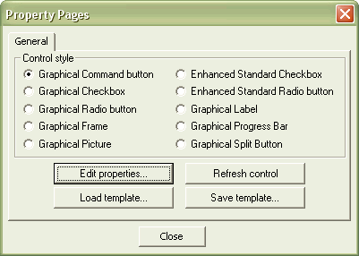
While you can define the style for your buttons at run-time with the button's Style property, the easiest way is to set the button's style at design-time using the control's property sheet.
Right-click the control and choose Properties from the contextual menu: the control's property sheet will appear.
Note: The image below has hot links to take you to explanations of the various button styles.

|
Style
|
Meaning
|
|
Graphical Command Button
|
The default selection. This button replaces an ordinary command button.
|
|
Graphical Checkbox
|
Replaces an ordinary checkbox.
|
|
Graphical Radio Button
|
Replaces an ordinary radio button. See the How to group Radio buttons together section for details.
|
|
Graphical Label
|
Replaces an ordinary label control. Can be used as a control container.
|
|
Graphical Frame
|
Replaces an ordinary graphical frame control. Can be used as a control container. See the How to use the control as a Frame control section for details.
|
|
Graphical Picture
|
Replaces an ordinary picture frame control. Can be used as a control container. See the How to use the control as a Picture control section for details.
|
|
Enhanced Standard Checkbox
|
Replaces the standard checkbox control. See the How to use Enhanced Standard controls section for details.
|
|
Enhanced Standard Radio Button
|
Replaces an ordinary radio button. See the How to use Enhanced Standard controls section and the How to group Radio buttons together section for details.
|
|
Graphical Progress Bar
|
Replaces the standard progress bar
|
|
Graphical Split Button
|
Replaces the Office-like split button
|
The following table explains the meaning of the other buttons on the control's property sheet:
|
Button
|
Meaning
|
|
Edit properties
|
Opens 3D Button Visual Editor for design-time editing.
|
|
Refresh control
|
Refreshes the button currently selected on the screen.
|
|
Load template
|
Loads a 3bt template from disk
|
|
Save template
|
Savess a 3bt template to disk
|
|
Close
|
Closes the property sheet.
|
|


